Benjamin Moore's Color of the Year: FIRST LIGHT
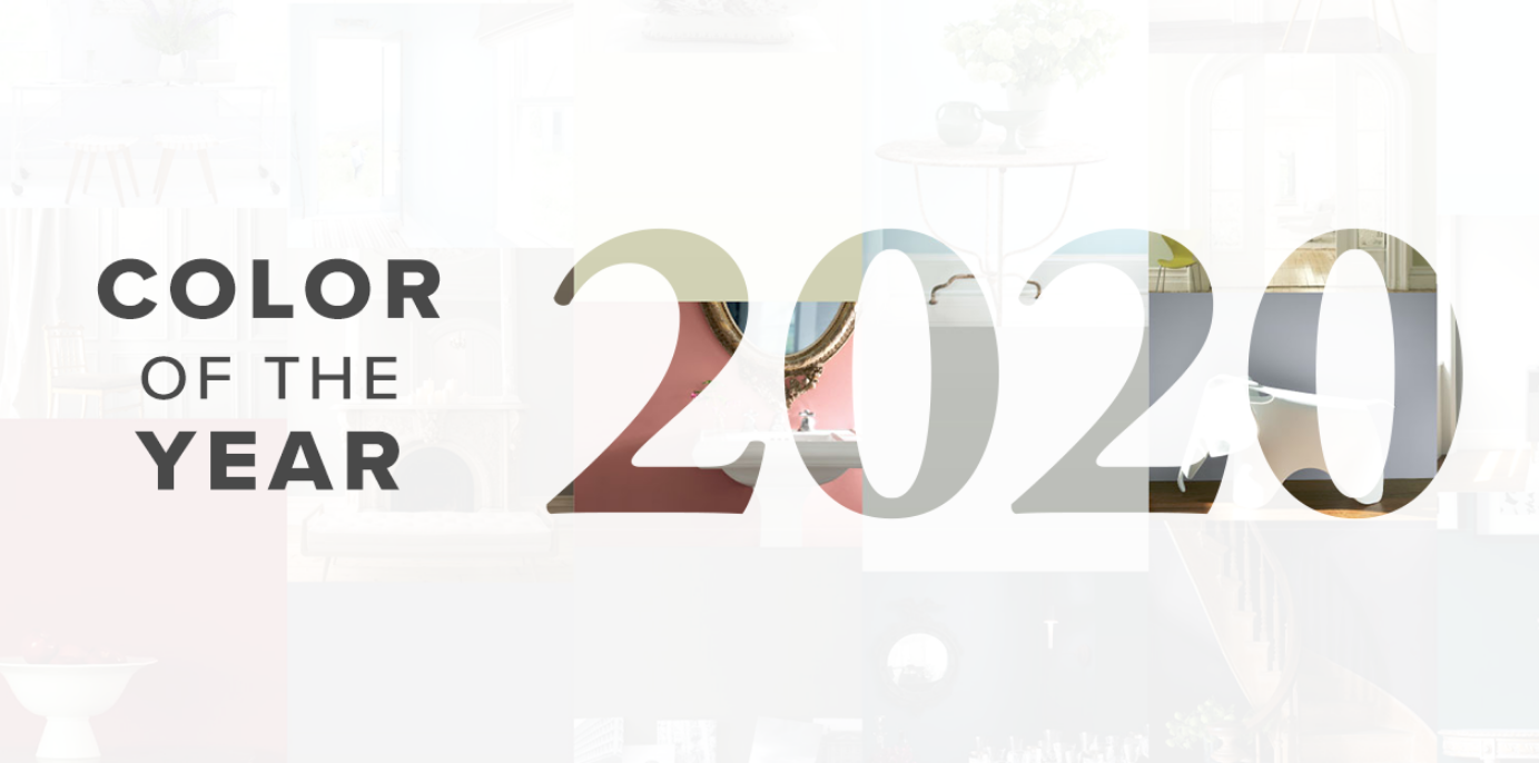
BENJAMIN MOORE Announces the COLOR OF THE YEAR:
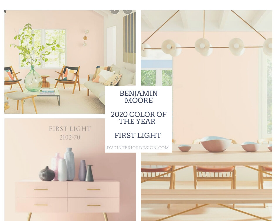
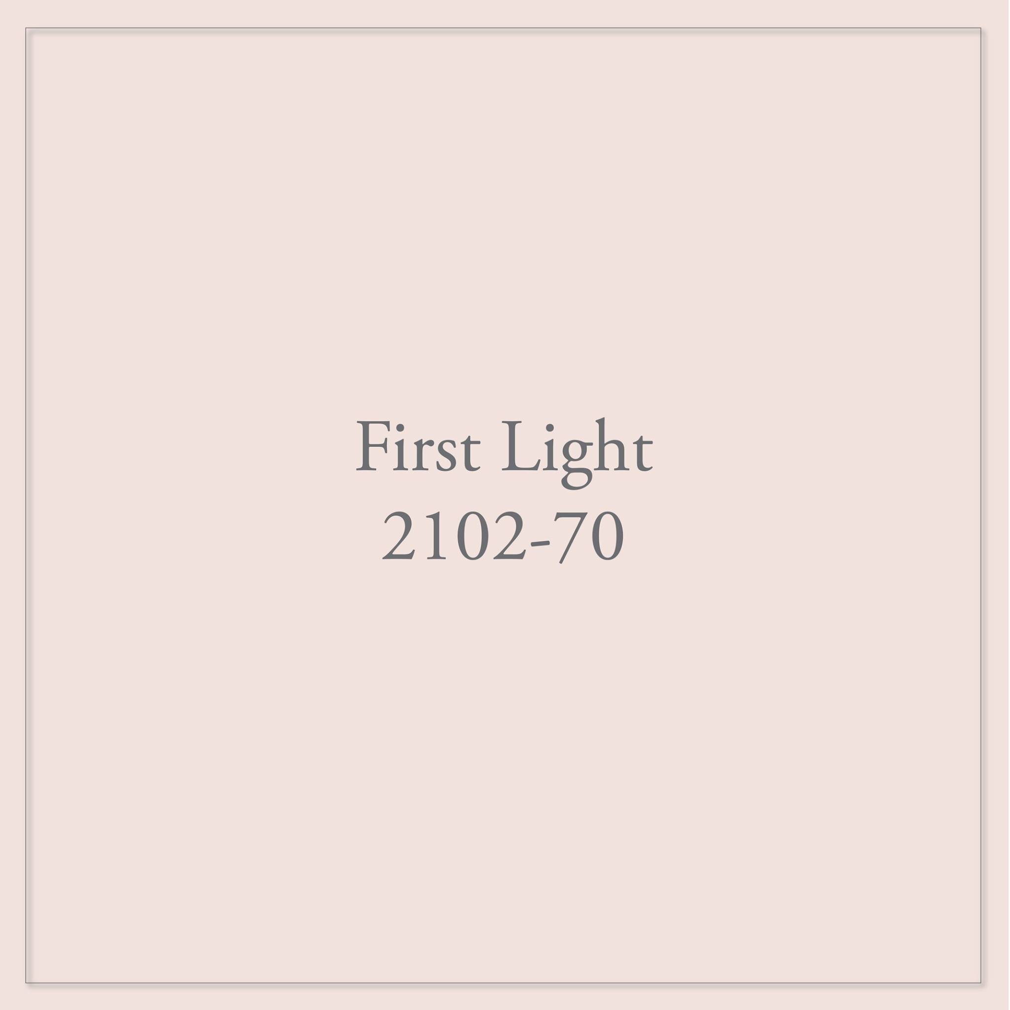
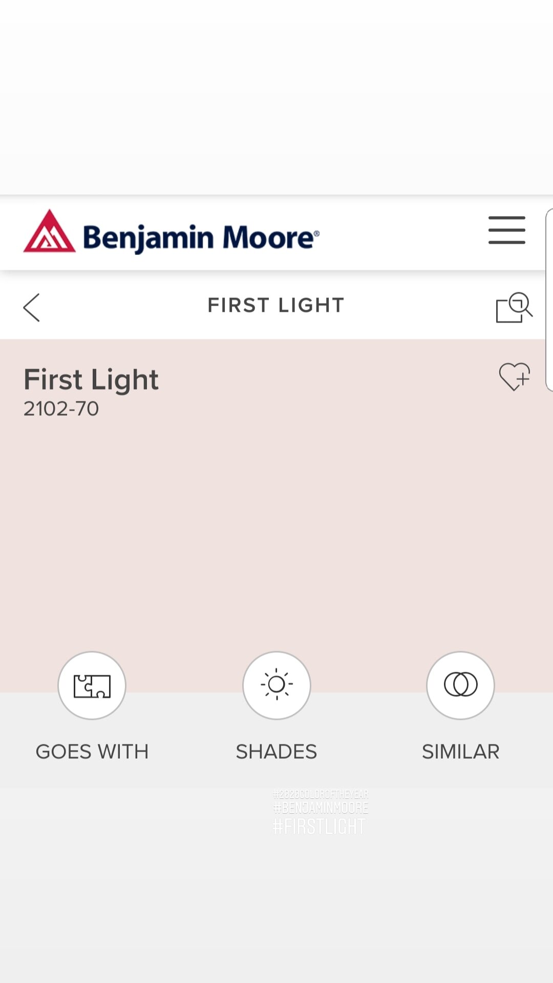
FIRST LIGHT 2120-70
COLORS TRENDS and How to Use Them in Your Home Explore The Pallete Here
We're going Pink (again).
When Benjamin Moore first announced the color this year as "First Light", they received some pushback from the design community. But I see this as a refreshing update to the “ Millenial Pink “ a strong pink color that was popular in 2018.
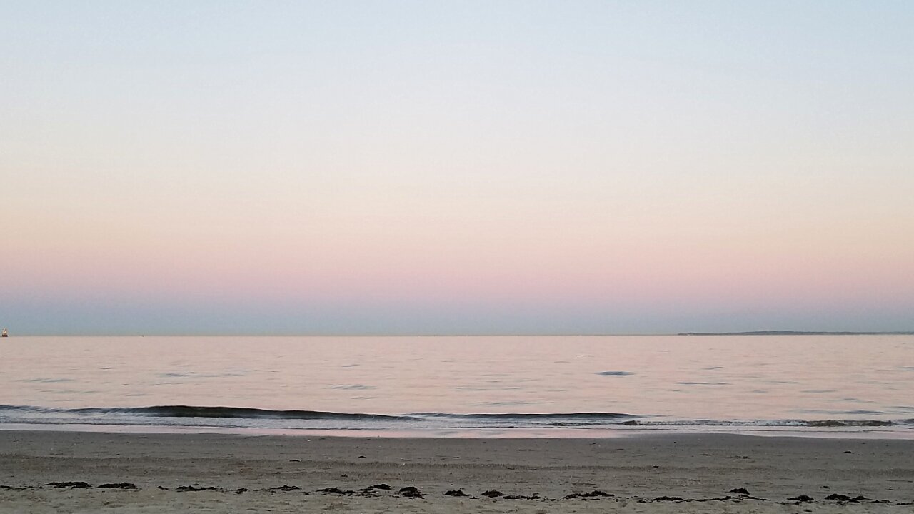
Tods Point, Connecticut
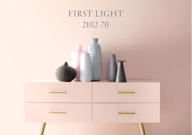
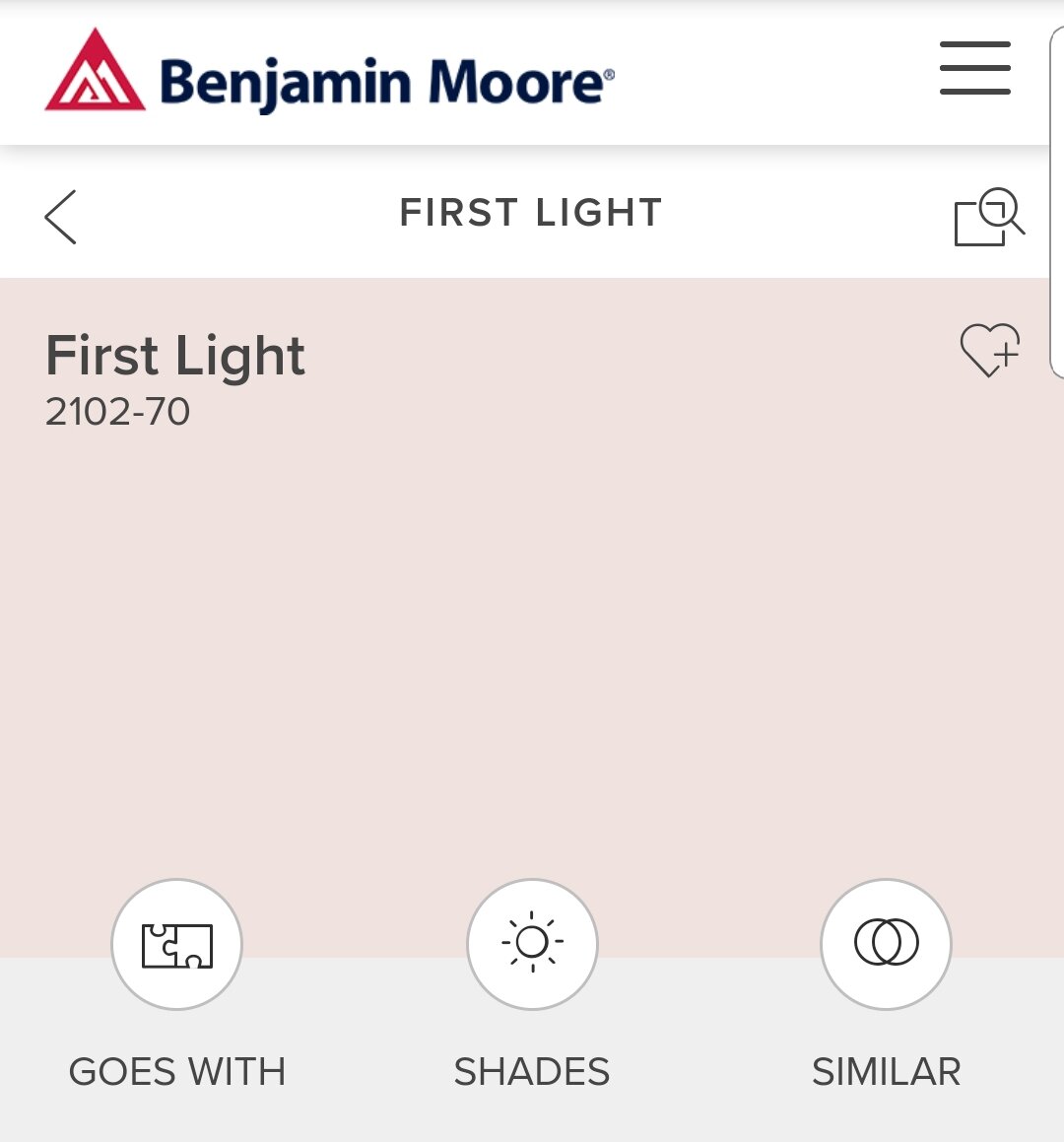
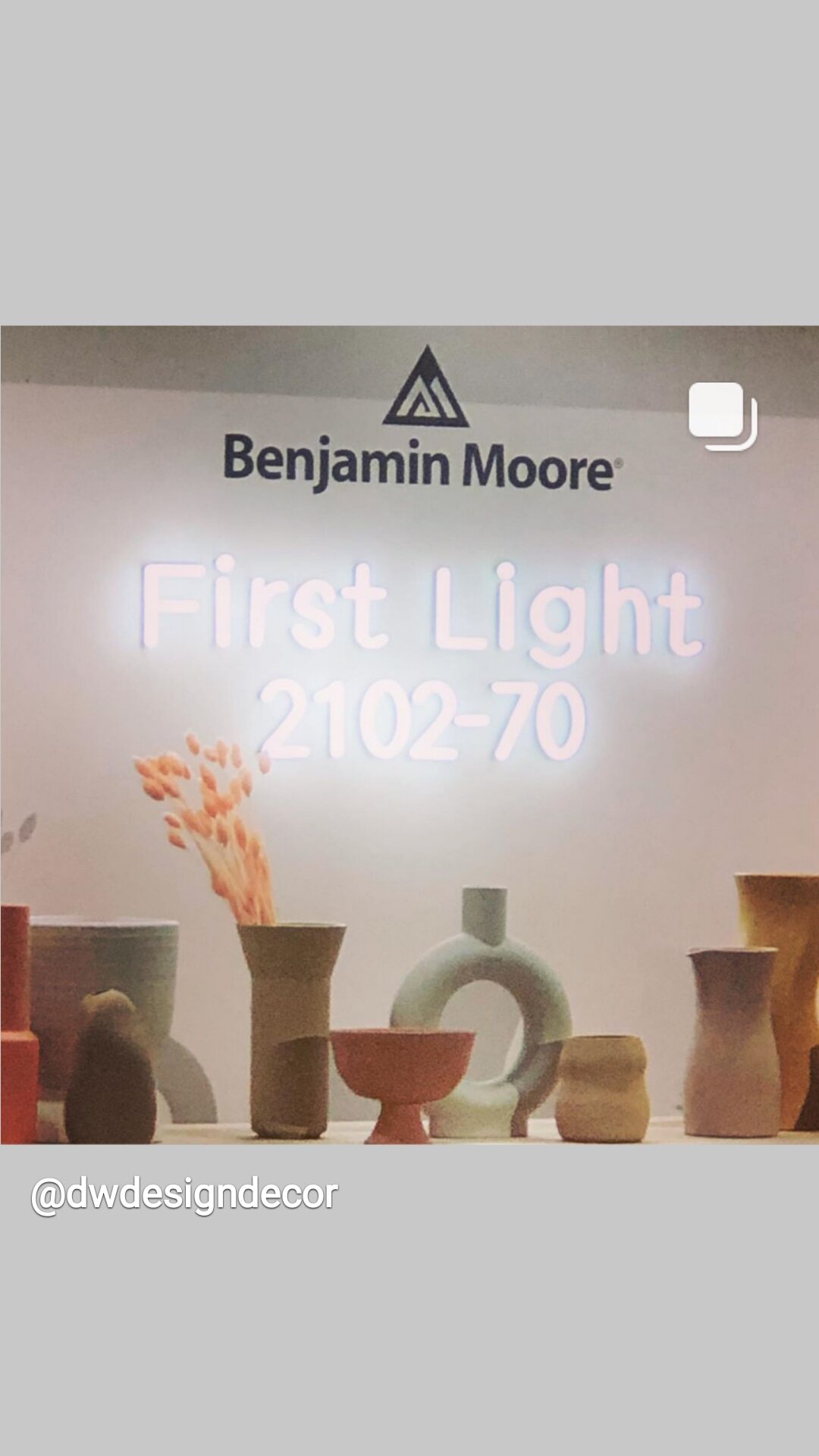
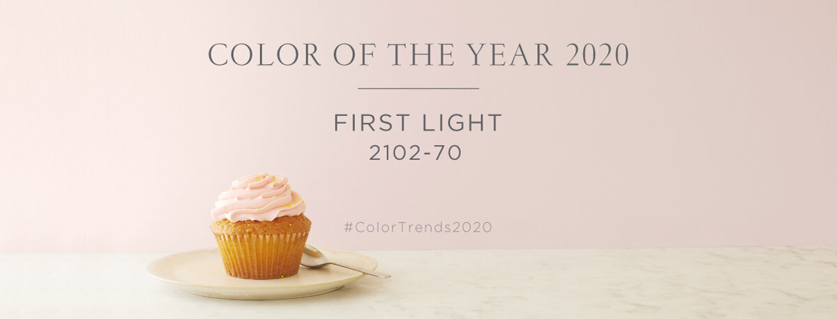
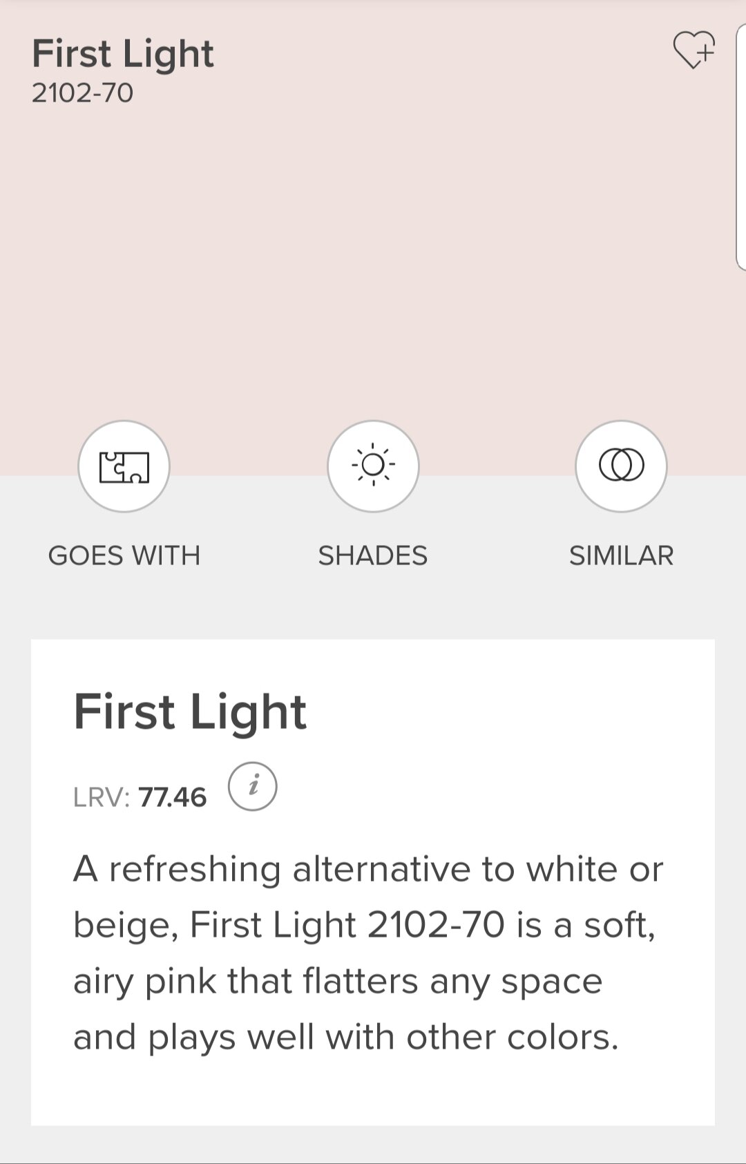
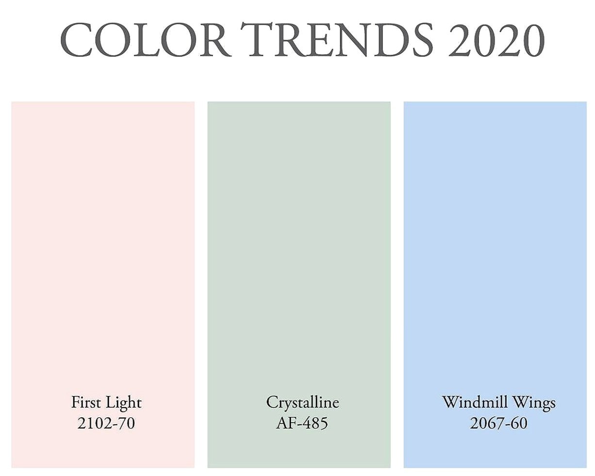
Benjamin Moore: First Light 2102-70 has been highlighted as the featured Color of the Year 2020.
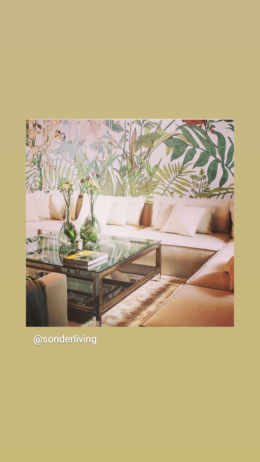
Nature-inspired and naturally distinctive color selection. A color from nature to complement many others.
2019: We embraced last year's Ben Moore color gray "Metropolitan AF-690, a stylish gray with cool undertones as seen in both our fashions and in new products for our homes.
This year’s introduction, First Light 2102-70, to me was an update of Millennial Pink.
How to best use this color?
FirstLight 2102-70 has a pale gray undertone that makes this subtle pink almost neutral; a delicate shade seen every day in nature in subtle accents from the sun.
It's a very spring color that may have surprised many, but I was excited as I am always thinking about how to bring a feeling of the outdoors into the interior of where we live. ( this is also a color of romance in Feng Shui)
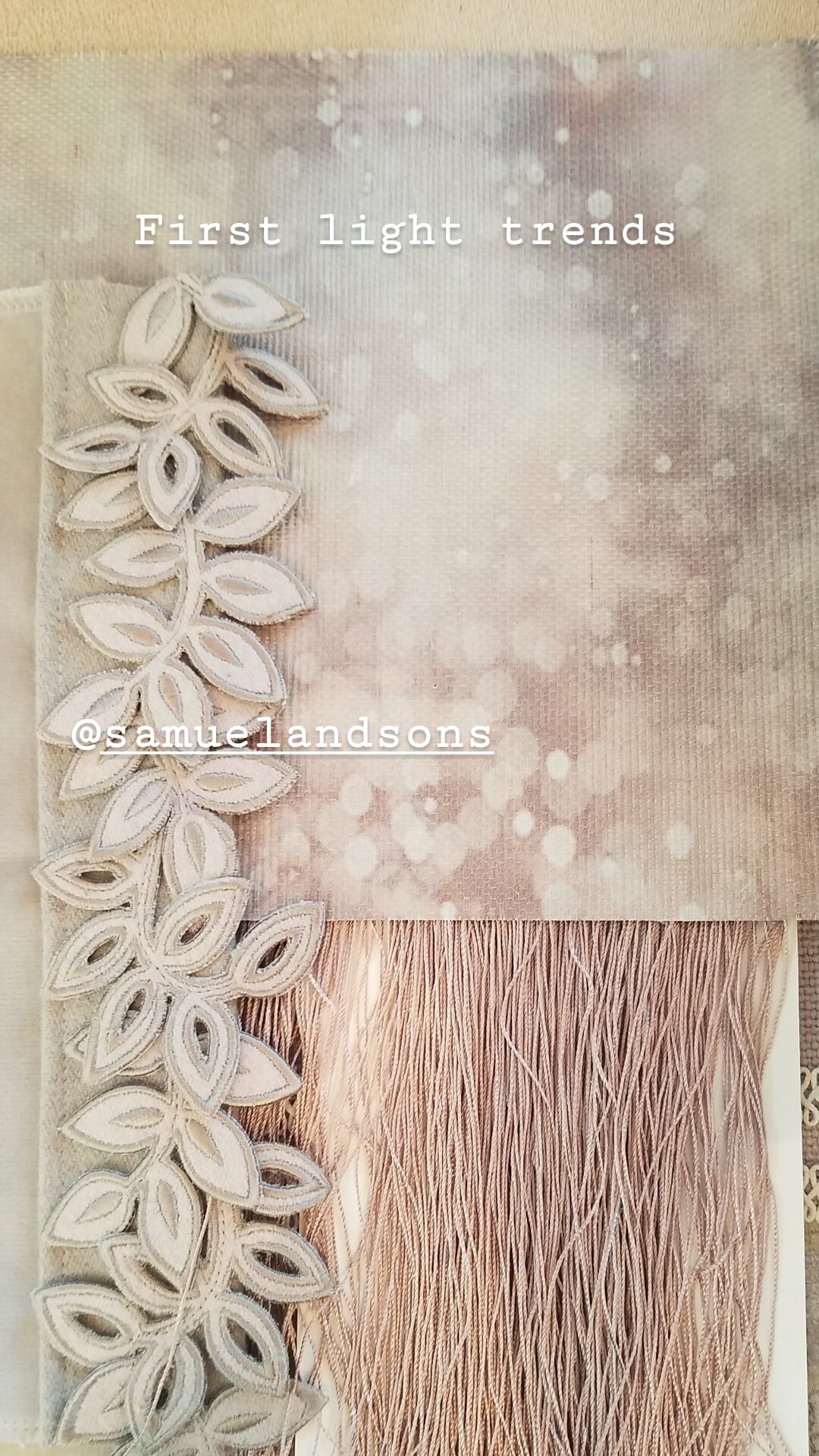
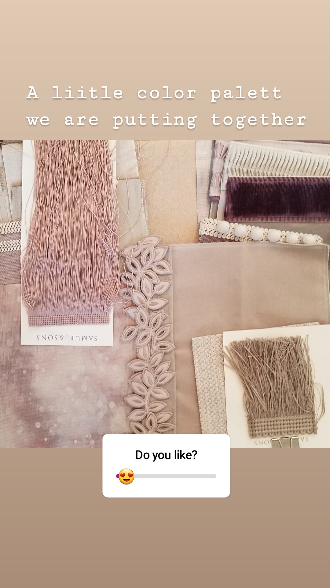
Mood Board with First Light
“Millennial Pink” gets an update.
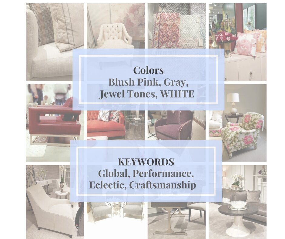
We attended High Point Market in 2017 and reported on the prevalent trends from manufacturers both nationally and internationally. High Point Market 2018 Trend Report
ARE BLUSH AND GREYS THE NEW NEUTRAL?
Now, for me, there is no such thing as "Trends" or the "Current Color" when selecting items for your home. I want you to choose furniture, fabrics, and objects that you like and as your designer, I help you organize and prioritize to make the best choices and get it to all flow and work together into a home that you will love living in.
HIGH POINT MARKET COLOR INDICATORS:
(Hpmkt is a trade-only market in High Point North Carolina. The onset of trends is usually seen here first as a strong indicator of change in the residential home decor market.)
While attending this year’s High Point Market, I did notice there were a few common themes in color and material selections and new directions due to consumer interests last year, combined with product advancements seen this year. First lights in alignment with consumer interest and trends.
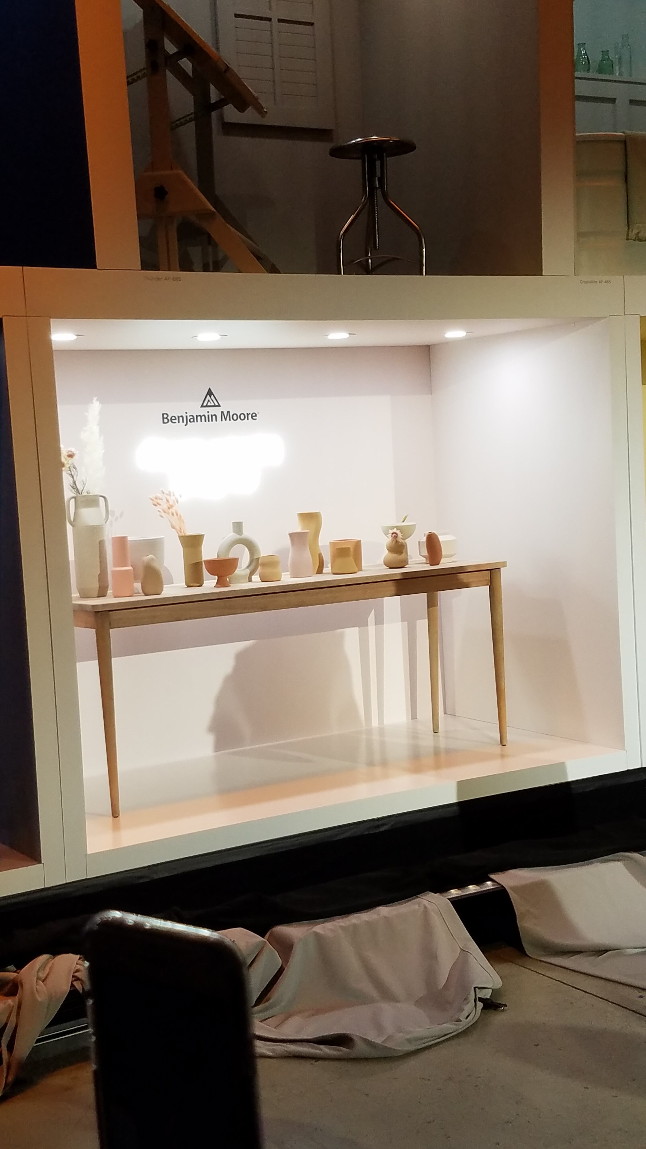
REVEALED: The Benjamin Moore Color of The Year is Announced in NYC!
Fellow design and friend, Denise Wenacure, invited me to join her at the NYC event of the year for Benjamin Moore Paints. It’s always a great party, and I love reconnecting with friends from the industry.
5 Ways to Decorate With the Color First Light
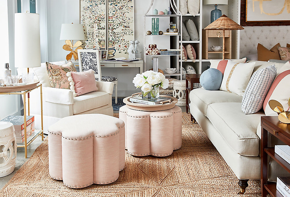
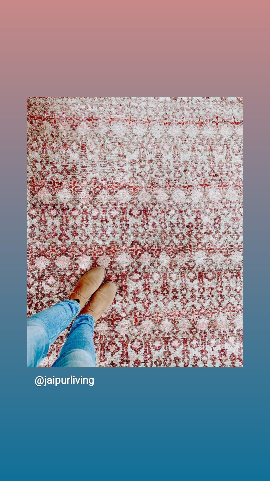
Use as an accent color is my first thought. An updated Accent rug, accessories, pillows.
For those not quite as adventurous with bold color, you don't have to paint an entire room. Bring in one boldly colored accessory, fabric or rug. It's often an easier way to incorporate bold color without going over the top or without making a costly mistake.
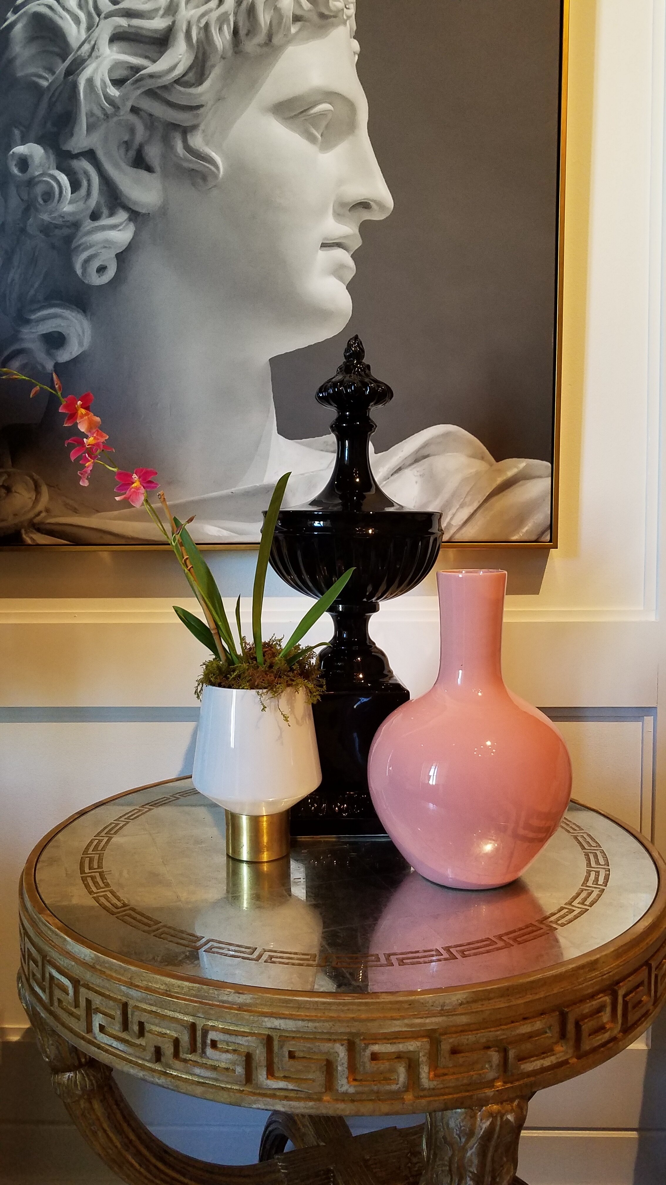
Blush Tabletop ceramics and accessories
2. Use as an accent color on a wall or in a small room.
Another way to add a dash of bold color is to try it in a small room. Powder rooms are typically small and are a great place to experiment with a bold color on the wall. Just don't paint your powder room a bad tone for seeing yourself in the mirror (like green) or you will always have an "off" look. Pink is always a good color.
Twin pink basins from Nood Co. are the standout feature in Norsu Home co-founder Nat Wheeler's blushing bathroom, where marble, pink mosaics, timber, and brass combine to create a swoon-worthy space. Photo: Lisa Cohen | Styling: Nat Wheeler
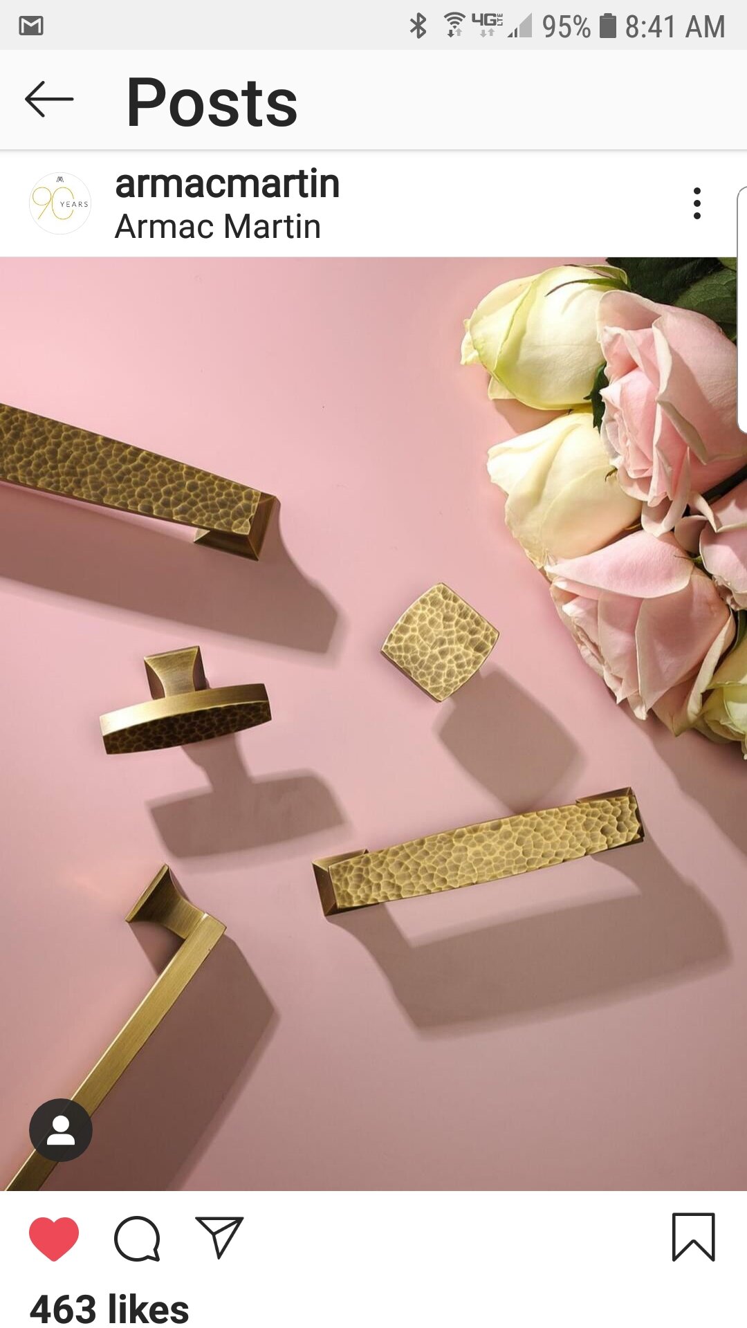
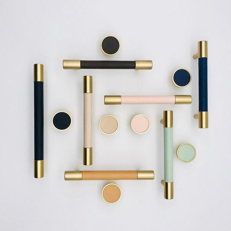
Add it to your hardware! A fabulous accent that I am crushing on here. I happen to be shopping for beautiful hardware, and I had to share these with you. Brass with Leather Drawer Pulls, Cabinet Pulls, and Drawer Knobs.
The Full List of Colors for 2020 is shown below. These are some of my faves!
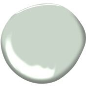
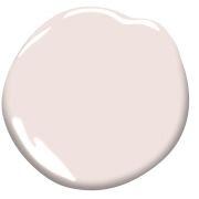
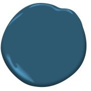
L-R: Golden Straw, Crystalline, First Light, and Blue Danube
Jeffery Bilhuber : Farrow & Ball : Setting Plaster offers a blush glow
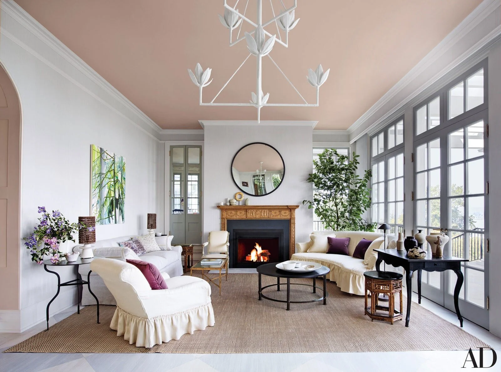
3. Use As a Ceiling Color for Your Bedroom or Living Room.
*** Feng Shui Tip: Pink is the color of romance! See our Post: Feng Shui for Your Bedroom for a good night's rest.
Door color: Farrow & Ball Pink Ground paint color. photo via pinterest : Homey Oh My
4. Pink Front Doors Have Us tickled!
We can’t think of a more soothing entrance to a mudroom than this dusty pink door. The wood detailing and rosy hue makes for a subtly stylish statement.
See more pink door inspo here: Southern Living
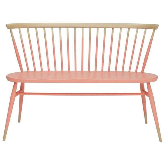
5. Paint a piece of furniture in pink!
A calming and beautiful color that is often overlooked for updating vintage or new pieces of furniture.
TARGET : Project 62 ( out of stock) but check out their new series here
Free download: Get the full color sheet for your reference right here.
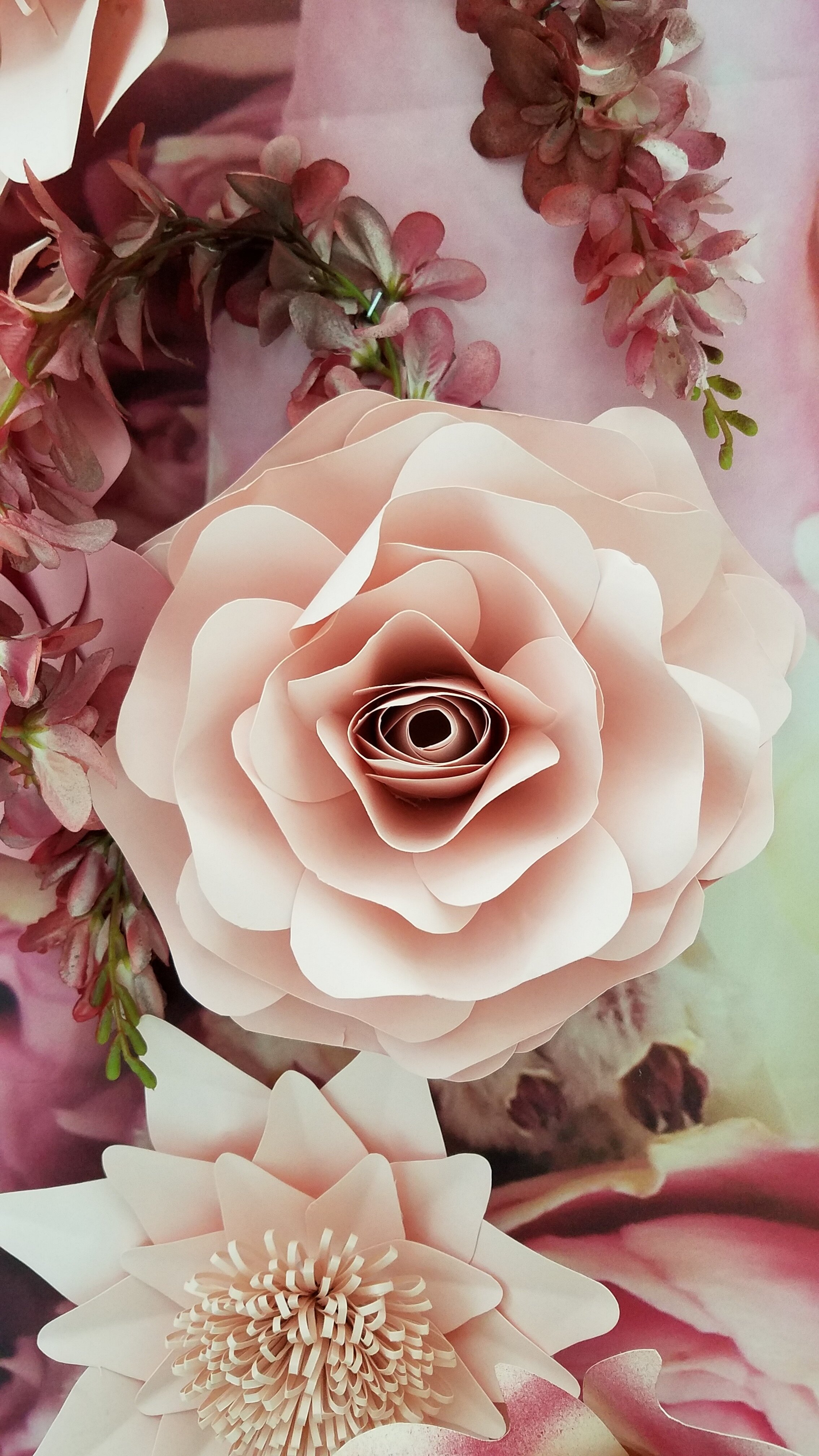
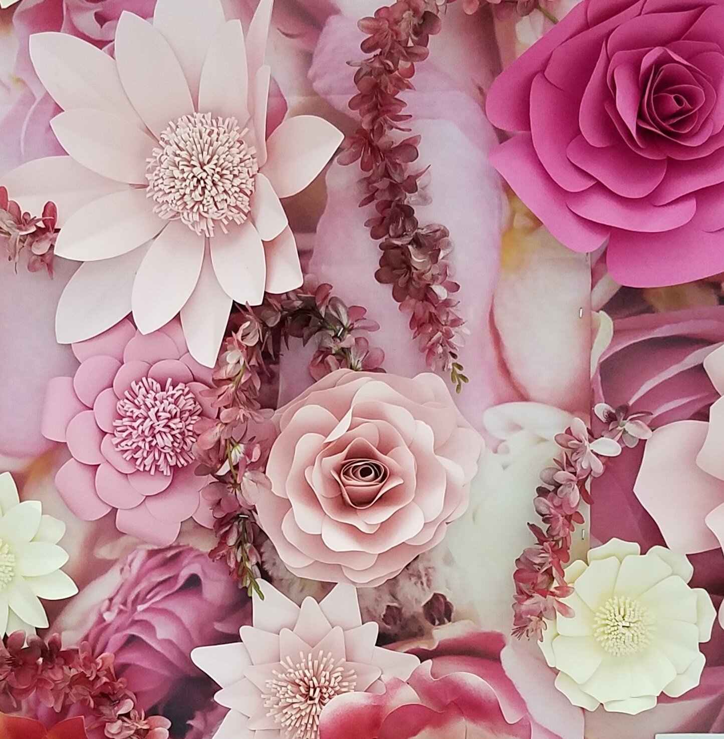
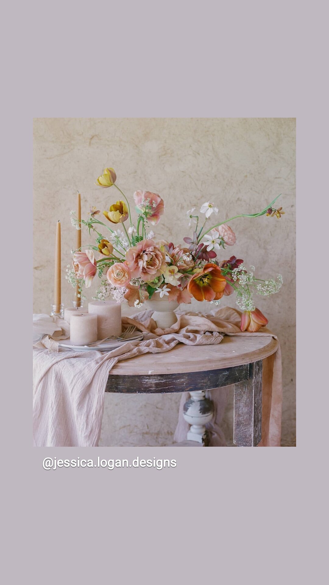
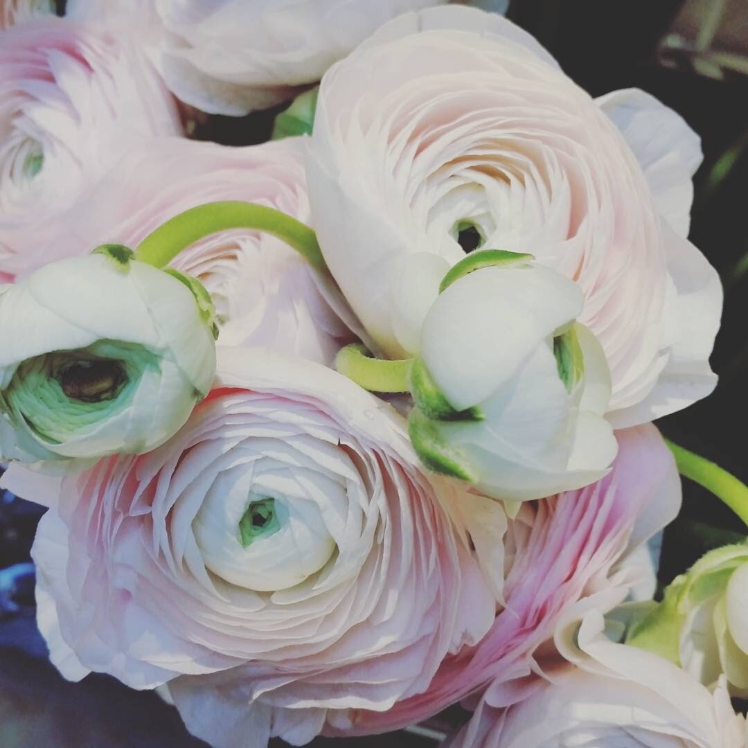
Using florals is a great way to use first light as an added special delight.
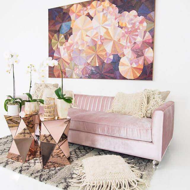
BONUS #6. Using Pink florals to freshen up your Living Room or Bedroom is always a good idea! Sparks romance and joy.
See our post on Designer Resources for the Best Faux Flowers. image: dvd interior design
327 Park Ave. “Mood Board” - dvd Interior Design
A beautiful layer of colors using Benjamin Moore 2020 color palette, First Light and Windmill Wings
Recommending beautiful paint color combinations to homeowners is essential to for designers and homeowners alike. Every year, our annual Color Trends Palette delivers a robust range of color pairings that enhance any room.
Looking for fresh interior paint colors for 2020? Explore the Benjamin Moore Color of the Year and Color Trends 2020 palette!
Farrow and Ball : Calamine
This is Farrow & Balls blush pink: Calamine
Another wonderful color in the FB pallet for 15 years and a very popular option, and similar to First Light.
Pink Bathroom tile ideas- First Light
Coordinating Color Trends and Ideas for 2020 Color of the Year BM: Danbe Blue is a wonderful blue for front doors and kitchen cabinets!
Danube Blue is on the new year list with First Light as a coordinating color: Here, Blue Danube 2062-30, a deeply elegant sapphire is the perfect pop for this front door.
Pretty in Pink
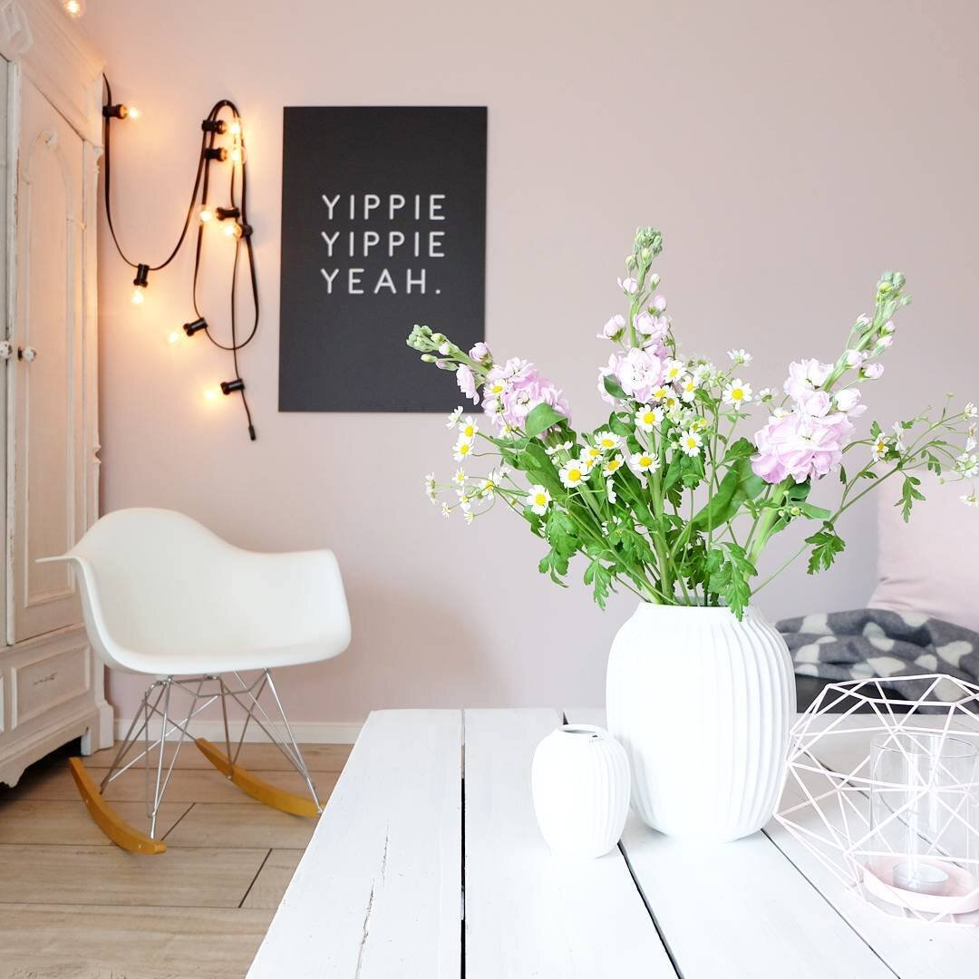
Even a small touch of pink/blush will add cheerfulness to a room, so use it liberally will truly elevate the mood.
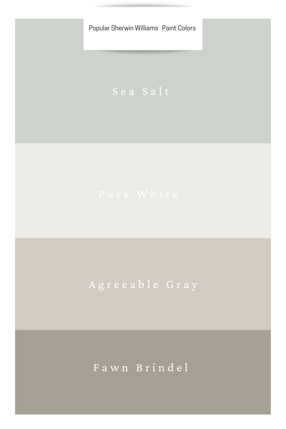
SEE OUR TOP SHERWIN WILLIAMS PAINT COLORS &
COLOR COMBINATIONS TO USE FOR YOUR HOME
Today I’m letting you in on the neutrals and a few colors I use often to help you confidently select the best colors for your home.
Note: If you are using Benjamin Moore paints, make sure to check out our post here: Top Paint Colors For Your Home by Benjamin Moore— everyone’s frustrated when trying to find the perfect paint color and whole home color solution.
Other Articles you may enjoy!
Learn From Us
Brass and pink is always a good idea.
Unusual color combinations that work.

